Descriptive Statistics
Descriptive statistics help us understand the data we have. They answer questions such as: What is typical? How much do the values vary? What does the distribution look like?
The best way to summarize a variable depends on what kind of variable it is. We will focus on two broad types: quantitative variables, whose values represent amounts, and categorical variables, whose values represent groups.
We will use Stata's nlsw88 example dataset, which contains information about 2,246 women in the National Longitudinal Survey. Because the data are from 1988, the wage values describe that historical sample—not wages today.
. webuse nlsw88
(NLSW, 1988 extract)

. describe wage hours tenure race

Variable      Storage   Display    Value
    name         type    format    label      Variable label
----------------------------------------------------------------
wage            float   %9.0g                 Hourly wage
hours           byte    %8.0g                 Usual hours worked
tenure          float   %9.0g                 Job tenure (years)
race            byte    %8.0g      racelbl    Race
Quantitative variables
Quantitative variables record numerical amounts. In this dataset, hourly wage, hours worked, and years at the current job are quantitative variables. We usually describe a quantitative variable by its center, spread, and shape.
Center: What is a typical value?
- The mean is the sum of the values divided by the number of observations.
- The median is the middle value after the observations are ordered.
- The mode is the most common value or interval.
The mean uses every value, so unusually high or low observations can pull it toward them. The median is less affected by extreme values. Comparing the two can tell us something about the shape of the distribution.
Spread: How different are the values?
- The range is the maximum minus the minimum.
- The interquartile range is the distance from the 25th percentile to the 75th percentile.
- The standard deviation describes how far values typically lie from the mean.
The range is easy to understand, but it depends entirely on the two most extreme observations. The interquartile range describes the middle half of the data. The standard deviation uses every observation and is most naturally interpreted alongside the mean.
Shape: How are the values distributed?
A distribution can be roughly symmetric, or it can be skewed toward one side. A right-skewed distribution has a longer tail toward larger values; a left-skewed distribution has a longer tail toward smaller values. A graph is usually the clearest way to see shape.
A closer look at hourly wage
. summarize wage, detail

                         Hourly wage
-------------------------------------------------------------
      Percentiles                              Obs       2,246
 25%     4.259257                              Mean    7.766949
 50%      6.27227                         Std. dev.    5.755523
 75%     9.597424                              Min     1.004952
                                                Max     40.74659
                                           Skewness     3.096199
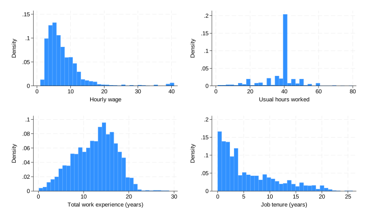
The median hourly wage is $6.27, while the mean is $7.77. A small number of relatively high wages pull the mean above the median. The positive skewness and the histogram below both show that the wage distribution is strongly right-skewed.
The middle half of hourly wages runs from $4.26 to $9.60, so the interquartile range is $9.60 − $4.26 = $5.34. The complete range is much wider—from $1.00 to $40.75—because it includes the most extreme values.
. histogram wage, frequency
Categorical variables
Categorical variables place observations into groups. Race and marital status are categorical variables in this dataset. We describe them with frequencies (counts) and percentages rather than means and standard deviations.
. tabulate race

       Race |      Freq.     Percent        Cum.
------------+-----------------------------------
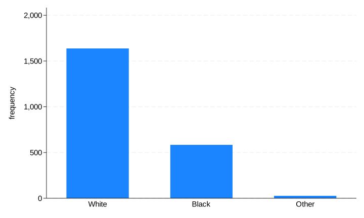
      White |      1,637       72.89       72.89
      Black |        583       25.96       98.84
      Other |         26        1.16      100.00
------------+-----------------------------------
      Total |      2,246      100.00
Of the 2,246 women in the dataset, 1,637—or 72.9%—are categorized as White. Counts tell us how many observations are in each group; percentages make groups easier to compare when datasets have different sizes.
. graph bar (count), over(race)
The main idea
Descriptive statistics summarize the observations in front of us. For a quantitative variable, describe its center, spread, and shape. For a categorical variable, report counts and percentages. In either case, pair numerical summaries with a graph: each can reveal something the other hides.